
Which Dress Colours Actually Suit Your Skin Tone: A Guide for Indian Women

Every Indian woman has some version of this memory. You're on a wedding shopping trip, standing in a shop with fifty shades of pink sarees spread across the counter, and somewhere behind you an aunty goes "yeh wala accha hai," pointing at a colour that looked stunning on the mannequin. You buy it because three people insisted it suits you. It photographs fine at the wedding, but something about it never quite felt like you. You couldn't say why. You still can't, really.
Here's what nobody tells you: most of the "find your perfect colours" advice floating around online wasn't built with your skin in mind at all. It's usually borrowed from Western seasonal colour analysis, the whole system of working out whether you're a Winter, a Spring, a Summer or an Autumn. It's a well-thought-out framework, and it works reasonably well for the narrower band of skin, hair and eye combinations it was designed around decades ago. Hand that same quiz to someone with wheatish skin that turns golden by May, or a deep, dusky complexion with jet black hair and warm brown eyes, and the categories start straining almost immediately. It simply wasn't built for the range of skin most of us actually have.
So let's set that system aside and use one that starts from where most Indian women are actually standing: warm and wheatish, cool and fair, or deep and dusky. Between them, these three groups cover the vast majority of Indian skin, and once you know which one is closest to you, picking a colour stops being a guessing game played out under shop tube lights.
Before You Start
A mix-up almost nobody clears up
Before the colours, one honest disclaimer. Your skin tone, meaning how light or deep it is, and your undertone, meaning the warmth or coolness sitting underneath that colour, are not the same thing, even though most of us use the two words interchangeably. You can absolutely have fair skin with a warm, golden undertone. You can have deep, dusky skin with a cool undertone. Decades of matrimonial ads and film magazines have flattened all of this into one straight line from fair to dusky, as if that alone tells you which colours will love you back. It doesn't, not fully.
That said, in real life, a lot of Indian skin does cluster roughly the way this guide is organised. Wheatish skin tends to lean warm, fair skin tends to lean cool, and deeper skin very often carries a rich, warm-neutral base. That's why we're using these familiar words on purpose, they're how you already describe your own skin, while still keeping the nuance in the back of your mind. If you read your section below and something doesn't quite click, you haven't done anything wrong. It probably just means your undertone and your depth don't follow the usual pattern, and a tip from the section next to yours might suit you better.
Step One
How do you actually find your undertone?
Skip the ten-question online quiz. These three checks take about two minutes, right now, wherever you're sitting.
-
01
Look at the veins on the inside of your wrist in daylight, not under a bulb. Greenish veins usually point to a warm undertone. Blue or purple veins usually point to cool. Can't really tell either way? You're probably neutral or olive, a category that shows up in Indian skin constantly and gets almost no attention in generic colour guides.
-
02
Hold a plain white sheet of paper, or a white dupatta, right up against your face. If your skin looks a little sallow or yellow next to it, that's warm. If it looks brighter and slightly rosier, that's cool. If the white just looks like white and your face looks fine either way, that's neutral.
-
03
Think about gold versus silver jewellery, a subject every Indian household already has strong opinions on. If gold jhumkas make your face look like it's glowing, that's warm. If your silver payal reads more like you than the gold one, that's cool. Can't choose between the two? Neutral, again.
None of these are laboratory-accurate, but line up two or three of them together and you'll have more than enough to work with.
Step Two · If This Is You
If you're warm and wheatish
Wheatish skin, that warm golden-beige so much of India actually has, usually sits on a warm undertone, and warm undertones were basically made for rich, earthy colour. Mustard is your best friend here, not the pale butter shade, the deep, spiced mustard you see on a good silk kurta. Rust, terracotta and burnt orange all sit beautifully against warm wheatish skin, and so do bottle green, olive, and a tomato-leaning red rather than a blue-based one. Camel and warm browns are quietly excellent for office wear, and gold jewellery is almost always going to flatter you more than silver.
Think twice about
Where you want to think twice is anything icy. A pale baby blue, a lavender-grey, a stark bluish white can sit a little flat against warm skin instead of lifting it. That doesn't make these colours off-limits, it just means they need backup. Pair an icy pastel kurta with gold jewellery or a warm-toned dupatta near your face, and it comes together instantly.
Step Two · If This Is You
If you're cool and fair
Fair skin with a cool undertone carries a pink or rosy base underneath, and this is where jewel tones earn their name. Emerald green, sapphire blue, a deep berry pink, and a true, jewel-box red all look gorgeous against cool fair skin. Fuchsia, plum and lavender work just as well, and black, worn well, reads as striking rather than draining.
Think twice about
Mustard and heavily orange-leaning warm shades are the ones to think through a little more. On their own, they can occasionally make cool fair skin look slightly sallow. The fix is simple: bring in something cool nearby, a silver necklace, a blue dupatta, anything that pulls your natural pink undertone back into the frame.
Step Two · If This Is You
If you're deep or dusky
This is the section that gets the least honest advice anywhere, and there's a reason for that. Indian fashion content grew up in the long shadow of the fairness cream industry, years of advertising that quietly suggested a lighter face was a more successful one, before brands finally started dropping words like "fair" and "whitening" from their packaging in recent years. That messaging didn't only sell cream. It also shaped a whole generation of "safe" styling advice for deeper skin: stick to muted tones, don't draw the eye, leave the bright pink for someone fairer. None of that was ever actually about colour theory. So here's the plain truth: there is no colour that is off-limits for deep or dusky skin. Not one.
Deep skin has the pigment to hold its own against real, saturated colour, which is exactly why jewel tones look so extraordinary on it: emerald, royal blue, magenta, hot pink and a rich mustard all read as striking rather than loud. White against deep skin doesn't wash anyone out, it creates one of the sharpest, most elegant contrasts there is. Black does the same. Even a true, hot red, often written off as "too much," tends to look sensational rather than overwhelming.
What actually works against you
What actually works against you is closer to the opposite of what you've probably been told. Dull, greige, overly muted shades sitting close to your own skin colour can flatten your features instead of lifting them, simply because there's nothing for the eye to catch onto. For deep skin, the rule isn't about avoiding certain colours. It's chasing contrast and saturation instead of playing it safe.
Shop The Edit
Pieces to build your palette around
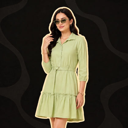
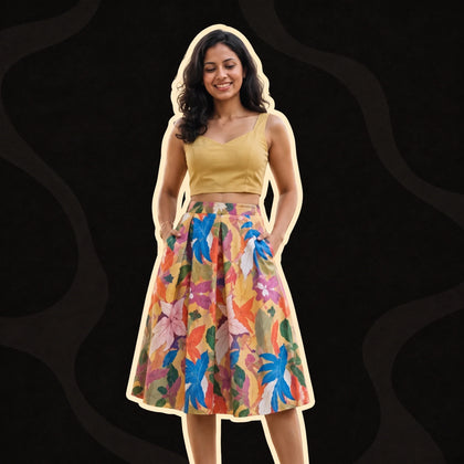
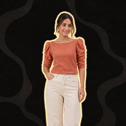
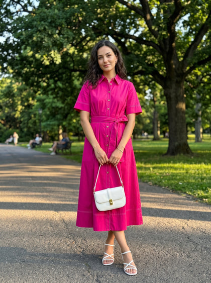
Four EverMore styles that put this guide to work, from warm earth tones to bright, saturated colour.


FAQs
More than most people realise, yes. The colour sitting closest to your face, your blouse, your kurta's neckline, your dupatta, does more visible work than the rest of the outfit put together, simply because it's the colour bouncing light back onto your skin. A saree in a shade that doesn't naturally suit you can still look wonderful with the right blouse, and the reverse is just as true.
No, and this deserves far more attention than it usually gets. Bridal red was never one colour, it's a whole family of them. A warm-toned bride often glows in a deep maroon or a brick, orange-leaning red. A cool-toned bride tends to look incredible in a blue-based, almost cherry red. A deeper-skinned bride can carry a bright, fully saturated red beautifully. Ask any lehenga shop to lay out three different reds side by side and the difference becomes obvious the moment you know what you're looking for.
Lighting changes colour more than people give it credit for. Plenty of Indian boutiques and fabric shops still rely on cool, white tube lighting, which tends to dull warm colours and slightly oversharpen cool ones compared to daylight or the warmer bulbs most homes actually use. If you're unsure about a colour, step towards the shop entrance or a window before you decide.
It holds up more often than you'd expect, though it isn't foolproof. It's really a low-effort version of the undertone test: gold flatters warm undertones, silver flatters cool ones, and if you honestly cannot pick a side, you're likely neutral, in which case wear whichever one is already sitting in your jewellery box.
It really can. The trick is choosing pastels with some depth to them rather than the chalky, washed-out kind. A dusty rose or a rich lilac will do far more for deep skin than a barely-there baby pink ever could.
They translate surprisingly well. With a print, look at the dominant colour rather than getting distracted by every small accent shade scattered through it, and the same undertone logic applies almost every time.
The bottom line
If there's one thing worth carrying forward from all of this, it's that "which colours suit me" was never meant to be a fixed shortlist of five approved shades you're allowed to wear for life. Think of it as a set of starting points, worth knowing, worth bending, and absolutely worth ignoring the day you fall for a colour that "isn't supposed to" work on you and it does anyway. Your skin was never a problem waiting to be solved before you earned the right to enjoy your wardrobe. It's just information. Now you have a slightly better map to make sense of it.
Found your look? Shop the EverMore edit.
Shop nowKeep reading
-
 Style guide
The Buy 2 Get 1 Free Formula: How to Turn 3 New Pieces Into 9 Outfits
Your cousin's sangeet is four days away and you are standing in front of a wardrobe that is, technically, full. Every hanger is...
-
 Style guide
Trendy vs Timeless: Which Pieces Are Actually Worth Buying on Repeat
Open Instagram on any given evening and within four scrolls you'll spot the same cherry red co-ord set on three different women...
-
 Style guide
What to Wear to Your College Farewell (If You Don't Want to Wear a Saree)
Somewhere in your class WhatsApp group, someone has already typed "what is everyone wearing for farewell," and by evening there...


